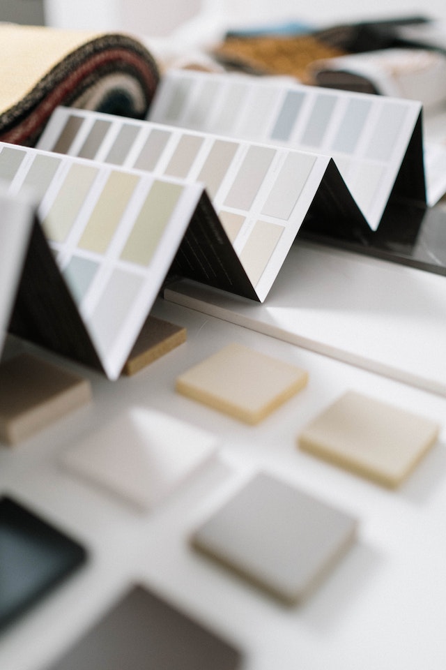
If you’ve ever stood in front of the paint chips at a store, overwhelmed by the bajillion shades of beige (who knew there were so many?), then you’re in the right place. Finding the perfect color palette for your home can feel like searching for a needle in a haystack. But fear not! We’re here to turn that massive haystack into a neatly organized, color-coordinated thread spool.
- Embrace Your Inner Mood Ring
Remember those rad mood rings from back in the day? Let’s channel that energy. Start by asking yourself how you want to feel in a particular room. Calm and serene? Perhaps a soft blue or gentle green. Energetic and inspired? Bright yellows or lively corals might be calling your name.
- Survey Your Stuff
Before you splash out on a new shade to do a spot of home painting, take a look around! Your favorite rug, a beloved piece of art, or even that funky vintage lamp can be the source of your palette inspiration.
- Take a Cue from Mother Nature
If there’s one lady who knows her color combos, it’s Mother Nature. Think of the soft pastels of a spring morning, the deep greens and blues of a quiet forest, or the fiery hues of a sunset. Grab a snapshot of your favorite outdoor scene and pull colors straight from there.
- Test the Waters Before Diving In
You wouldn’t marry someone after the first date (or would you? No judgment here!)! Likewise, don’t commit to a color without dating it a little. Grab a few sample pots and paint swatches on your wall. Check them in the morning, noon, and night to see how they vibe in different lights.

- Know Your Undertones
Colors may seem straightforward, but they often have sneaky undertones that can change how they look on your walls. That soft gray might turn out to have blue undertones, making your room feel colder. A good trick? Hold the paint chip next to something pure white to draw out its true colors and undertones.
- Flow it Together
Think of your home as one cohesive unit, not separate boxes. The colors from one room should flow naturally to the next. This doesn’t mean painting every room the same shade of taupe; it just means there should be a harmonious transition between spaces.
- Don’t Forget Finishes
Matte, eggshell, satin, glossy — these aren’t just fancy words. The finish can drastically affect how the color appears and how easily your walls can be cleaned. For high-traffic areas, you might want a finish that’s more wipeable.
- Embrace Neutrals (with a twist)
Neutrals provide a great base and give you a lot of flexibility. But who says neutrals have to be boring? Opt for beiges with a hint of pink or grays with a touch of lavender for a fun twist on the classics.
- Go Beyond Walls
When we talk palettes, we’re not just talking walls. Think about trim, ceilings, and even floors. A painted ceiling can be a whimsical touch, and colored trim can redefine your space.
When it comes to color palettes, there is no right and wrong, so although the above tips can help, at the end of the day, trusting your gut is the smartest thing you can do!